The Ocean Foundation
My first collaboration with The Ocean Foundation (TOF) was on EQUISEA, a one-of-a-kind philanthropic ocean science fund looking to improve equity in ocean science. My task was to develop the brand’s logo, I guided a session with some of the key authors of the platform, such as staff from the Ocean Foundation and the University of Ghana, to help them outline the brand’s target audiences and brand values to complement their concept note.
The logo was developed as a Wordmark to maintain neutrality as it had to appeal to diverse communities around the world and leaders of the developing world and governments. The ‘A’ is intervened with a wave to work as the icon and give a more visual representation of the ocean. The colours represent the diversity of people encompassed by the brand. EQUISEA represents many communities in under resourced regions that are facing challenges in science research funding.
The creation of a new logo was essential to properly portray the Alliance’s work
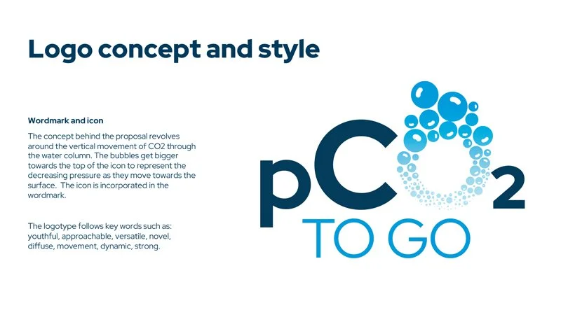
My second collaboration with The Ocean Foundation was the creation of the logotype and guidelines for their product pCO2 to Go, a tool to measure carbon dioxide dissolved in seawater, which is increasing due to carbon emissions and drives ocean acidification.
The concept behind the proposal revolves around the vertical movement of CO2 through the water column. The bubbles get bigger towards the top of the icon to represent the decreasing pressure as they move towards the surface.
The icon is incorporated in the wordmark, a versatile choice, with both the text and icon working together to reinforce the brand, in this case, both become one element.


